Asheville Area Chamber of Commerce
Website Design
1
Background
The Asheville Area Chamber of Commerce works hard to create a vibrant economy.
The Asheville Chamber has three main focuses; to serve the community with employment opportunities and relocation advice, to increase chamber membership with a common vision of Asheville, and to conduct and share research about Asheville's Economic Development. As a very established and reputable organization, the Asheville Chamber needed a website that would be robust enough to serve the multiple tiers of services and communicate the organization's aims.

2
Challenges & Objectives
Dynamic Layout and Sidebar
Mega Menu Navigation
Third-Party Data Integration
Content Toggling UX
Dynamic Sidebar and Templates
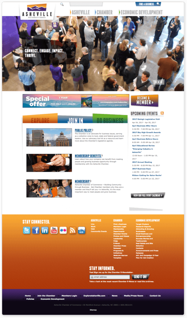
To create a website that would truly scale with the future of the chamber, it was important to keep the content throughout the site up-to-date. We used a dynamic post structure for the homepage and sidebar, to automatically refresh the site with current content.
1. Dynamic Menus
Automatically add pages to the navigation as new categories and resources are developed.
2. Homepage Regeneration
Website engineers associated new, featured content to fit in either "Explore", "Join In" or "Do Business". This kept new pages organized and kept the homepage feeling fresh and up to date.
3. Events Calendar Sidebar
As new Events were added, the "Events Sidebar" would add a new event to the calendar and is easily accessed throughout the site.
Mega Menu Navigation
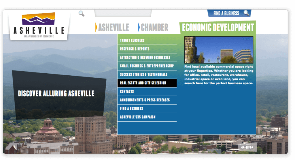
With such a robust and content-rich site architecture, the team decided to amp up the user experience by adding a preview image and lead text as the user scrolls through the main navigation. This was extremely effective in helping the user access what they were looking for.
1. Easy to Manage
Developed a menu-management system that let the client manage and update the image and previews within the menu with ease.
2. Design applies consistently
The mega-menus were designed with the knowledge that if a featured image was not added to a page, it would not impact the functionality of the menu. Alternatively, the mega-menu content is flexible enough to add images and text excerpts.
3. Adapted for Mobile
The mobile menu experience is quite different and a partner-menu system was developed to adapt to smaller devices. The picture and excerpt were removed in order for navigation to remain simple.
Third-Party Data Integration
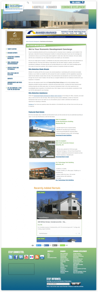
The Asheville Chamber has many partners and asked the development team to somehow dynamically pull content from their partners and embed it into the new Chamber site. This is how we did it:
1. Wrapped Content into the Design
We removed the outer theme from the client's third-party remote pages and wrapped them in a frame on the main site. We then passed data to the remote pages so we could still have control and search capability.
2. Incorporated into the Database
The pulled in third-party data was pulled into the website portal and content system so the client was able to feature any content they desired, even if it was from an external, third-party source.
3. Sub-Branded Section
For some sections of the website, an alternate logo was needed to best represent the content, were able to change the logo and color scheme to match the brand of the third-party data.
Content Toggling UX
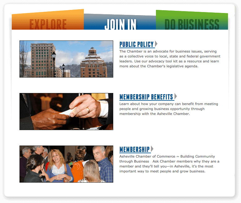
Granting the page visitors the ability to show/hide information became an essential need for this robust site. We developed a toggling and excerpt UX that enabled users to open and close the information they were needing to access.
1. Show/Hide in the Menu
The sidebar menus are two-tiered with a main label and sub-content. Main labels on the menus could be clicked to reveal sub-content options.
2. Toggle Content on the Homepage
In order to display all the content on the homepage that the client had requested, we used an accordion-style toggling module that housed a lot of content within a single container.
3. Preview Content with Excerpts
We used a post-preview module that would format a page into a small preview in a list of content with the option to "Read More". This showed part of the content and gave the user the ability to explore for more.
3
Website Design
