How Healthy Living Went Digital
BACKGROUND
The Skyterra mission is to serve the whole health of the individual. They believe that healthy living is not just for the out-of-shape or the elite, it is for everyone. For this reason, Skyterra imagined that their brand would go beyond their on-site wellness center and extend into the digital world for everyone to access. Greenstone Media and Skyterra worked together on the Skyterra Interactive Mobile App to deliver curated health education specific to the needs of each user.

THE SOLUTIONS:
1
User Engagement Strategy
A key measurement of success will be if clients are using the app regularly. Skyterra Interactive is designed to help establish healthy habits. For this reason regular user engagement is essential.
1. Designed for Each User
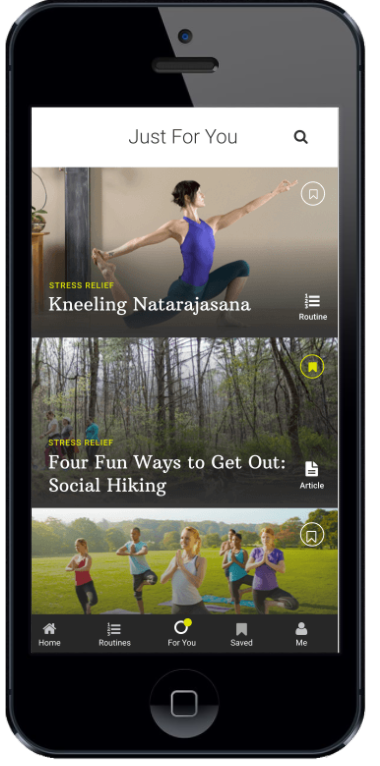
We implemented an algorithm and user assessment to curate content specifically for each user's interests and needs. See Figure 1.1.
2. Customize the Experience
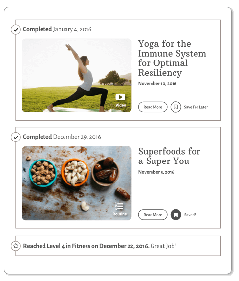
We created a "Save to Library" so favorite content will always be easy to re-access.
3. Gamification
We incorporated activity tracking that adds and depreciates points based upon activity or inactivity when completing health tasks. See figure 1.2.
4. Push Notifications
We added several push notifications to congratulate users on their progress, to remind them when new content has been added to their list, and to encourage them to keep going if they appear to be less active.
2
Tailored Content
The makers of Skyterra are aware that one health approach will not fit everyone's needs. Users excel in certain areas but will need extra assistance in other areas. Our challenge was to automate a curated health advice system to deliver content based on each user's specific strengths and weaknesses.
1. Implement Assessment Test
With the help of Skyterra's brilliant team, we created a simple 15-question assessment test that evaluates each user's strengths and weaknesses.
2. Feed Algorithm
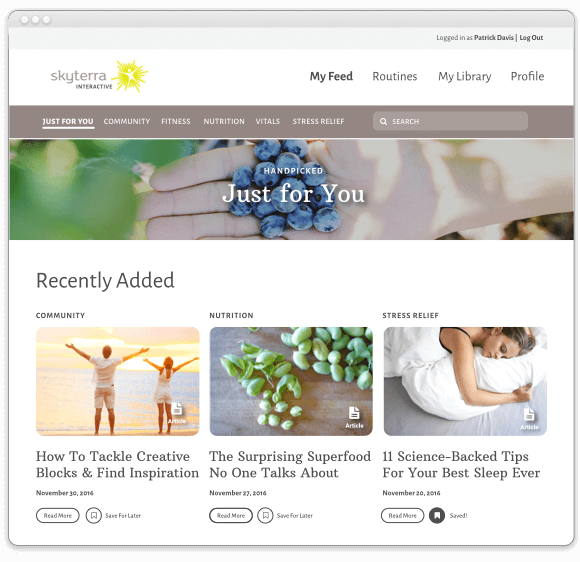
A sophisticated algorithm filters the Skyterra content database to show only winning information for that specific user. Each user will have a unique "My Feed" displaying the most relevant content for their health. See figure 2.1.
3. Evolves as the User Does
As the user continues to use Skyterra Interactive, their proficiency in areas of health will improve and their feed will adjust content based on their most recent progress.
3
Simple Interface for All Users
Regardless of size or age, Skyterra strongly believes that everybody should be supported to practice healthy habits. In order to accommodate to all technical ability, we implemented different strategies for quick learning and easy use.
1. Confirmed Interactions
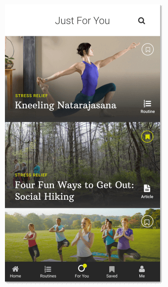
Iconography is great for many situations, but oftentimes iconography paired with call to action text draw the most clarity. When users mark an event, the icon color and button text change to show confirmed action. See figure 3.1.
2. User Walkthroughs
A simple three-step account registration process sets users up quickly and directs them to take the assessment test and set up their profile.
3. Simple and Consistent UI
The navigation is all held within five core sections of the app. The navigation is consistently available for all sections of the app.
4
Increase Traffic and Conversions
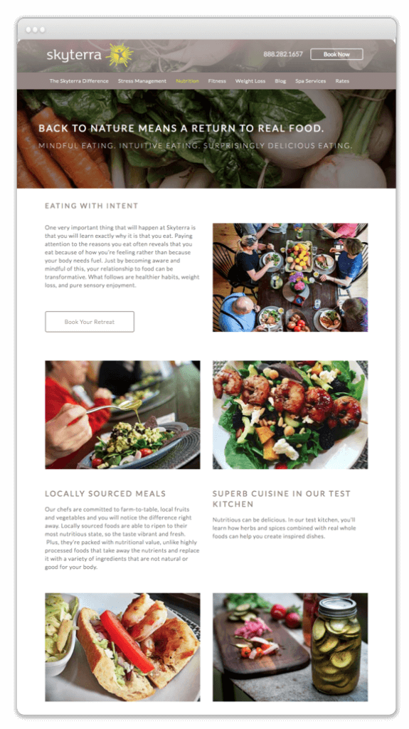
Skyterra Wellness' company website was falling short of their traffic and conversion goals. We were asked to refine their digital marketing efforts and upgrade the website to perform better in organic & paid search.
1. Website Restructure & On-Page SEO
Keywords and keyword research is an important part of any digital marketing effort. On a website that effects everything from the navigation structure to the copy and it is important to have a comprehensive plan in place. For Skyterra's website we not only implemented a site wide keyword strategy but also redesigned and reorganized the content in order to present the user with a clear picture of Skyterra's amazing wellness program.
2. AdWords Campaigns
Utilizing Google's best practices we optimized their active campaign using negative keywords, text ad optimizations, ad extensions and keyword refinement. Our efforts resulted in a decrease of wasted spending, increase in their ad quality score, click through rate and conversions. We then deployed re-marketing campaigns and created new campaigns and ad groups to further refine their paid advertising efforts.
