One of the best ways for higher education institutions to secure enrollments is through the internet. With seamless communication over any distance, it’s easier than ever to set up a website that tells people about who you are as an institution, what you stand for, and what you have to offer to those who enroll.
The problem? Every other institution is doing the exact same thing, and you need to find ways to stand out. The best way to do that is by auditing your website for conversion rate optimization, paying particular attention to main pages like your home page and program pages since these are often what prospects see early on in their journey towards enrollment.
Watch this video to get insights into what elements your program pages need in order to “pull their weight” and convert more of your online audience into enrolled students. Continue reading for more tips on how to create a program page that converts, tell if your existing program page is properly optimized, and what to do if you want to optimize it further.
What Does an Optimized Program Page Look Like?
To better understand the importance of these optimizations and the impact they make, you can compare the unoptimized example in the video with a program page we recently created for one of our clients: Southern Illinois University Edwardsville and their Surveying and Geomatics program. Note that it has all the elements of a high-converting program page, giving readers a very clear picture of what the program entails, how it benefits students who complete the program, and how they can get involved.
Watch the video for more details on what elements we included and why.
Of course, the makings of an effective program page run much deeper than just these elements. Let’s take a look at some of the most important things to have on your program page for higher conversion rates. As you read, keep your program pages in mind. This will help give you a better idea of what’s already working well, and what could be optimized to make it more effective..
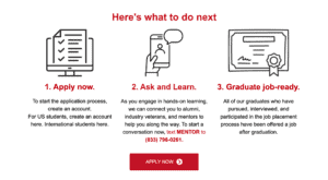
Prominently State Program Names
Though this likely goes without saying, students shouldn’t have to guess if they’re in the right place. It’s surprising how often we see landing pages that don’t included the name of the program “above the fold” (at the top of the page, before the user scrolls down). The program name should be stated prominently alongside the name of your institution, so that when leads land on the page, they immediately know whether they are in the right place or not.

Include a Strong Call to Action
The best way to increase conversions is by guiding your readers to the desired outcome. Rather than simply giving them information, tell them what to do with that information, and do it in a way that grabs their attention. If you take a look at SIUE’s website, you’ll notice that there’s a large red button at the top of the screen that urges readers to “apply now.”
This button appears again at the end of each section of the page, reminding interested users of what they need to do to get involved in the program. Replicating this with your program page will encourage students to apply, rather than mulling over it and potentially moving on or forgetting to do so.
Focus on First Impressions
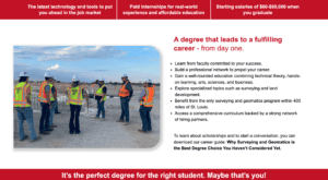
Your reader will start forming opinions about your institution and its programs as soon as they click on the program page. As such, the first part of your page is one of the most important. If what they initially see doesn’t grab their attention, they may click off before seeing everything your program offers. To prevent this, we recommend including several key elements in your program page’s header.
- The name of your school: Making the name of your school immediately visible creates a strong sense of identity. This will help readers remember your institution and make it stand out in their minds.
- The name of the program: For the same reason, it’s important to include the name of the program you’re advertising. If it’s not immediately visible, readers may be confused as to what they’re reading about, leading to misunderstandings and lost conversions.
- The “why” of the program: Be sure to immediately tell students the reasons they should be interested in your program. What sets you apart from the rest? Job security after graduation? Low tuition and robust financial aid? Flexible schedule options for students with obligations outside the classroom? Whatever your program’s unique traits may be, make sure that students can easily find out what they are.
- Your ultimate goal/their next steps: Whether securing an application or getting readers to sign up for an orientation, your program page was built with a purpose. Be sure that your purpose is clearly stated, and that students can easily proceed to the next steps you’ve prepared for them through a call-to-action button. In SIUE’s case, the “apply now” button filled this niche, though it may differ for you. Regardless, be sure that it’s visible from the start.
Break Up Text For Readability
Your program page should be easily digestible, which is best achieved by breaking up dense paragraphs into smaller chunks of text. If a prospective student clicks on your program page and sees nothing but a wall of text, they’ll likely feel overwhelmed, having neither the time nor the patience to sort through it all. This doesn’t necessarily mean that you have to reduce the amount of information on your page, though– sometimes, a little reformatting is all you need.
Let’s examine SIUE’s program page again. First of all, notice that every chunk of text on the page is less than 100 words long. Each small chunk of text conveys an important idea, which allows them to stand out as individual pieces of information rather than a jumbled mess of facts, statistics, and self-promotion. Headers and bullet points are used throughout the page to further distinguish ideas from each other, and the red-on-white color scheme creates contrast and grabs the reader’s attention.
Add Images to Your Page
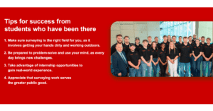
Images also serve several purposes on SIUE’s page. First, the banner image shows a surveyor at work, helping readers to visualize their future careers if they choose this program. Next, the alumni testimonials section uses pictures of each alum to help humanize their testimonials. When the reader sees the faces paired with text, they understand that it’s not just some faceless entity praising the program– it’s an actual person who has attained success because of your program, and that same success could be theirs if they choose to study with you.
In the following section, images are used to further divide pieces of information, and are paired with text to create a concrete image in the reader’s mind. An image of a surveyor at work is paired with the “scholarships and hiring” subheader, showing that SIUE will connect its students to opportunities for hands-on experience and future careers. The image for “industry support” shows a real example of one of SIUE’s partners, providing evidence to their claim that students will be able to form industry connections while studying.
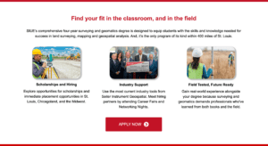
Using images this way on your program page will make it much more memorable, grab your reader’s attention, and turn your institution into a front-runner for the reader’s educational future, rather than just another bullet point on a long list of options.
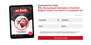
Provide a Low-Commitment Option
Not everyone who lands on your program will be ready to apply, at least not right away. It’s important to provide at least 1 alternative next step for leads who are still interested, but need a bit more information as they mull over their decision. Whether that’s providing them with an option to “Schedule a Virtual Tour” or “Join A Virtual Info Session”, or offering a free guide to download, these secondary calls-to-action provide your prospects with more helpful information while also giving you the opportunity to capture their contact details so you can continiue nurturing them towards conversion.
We Can Help!
Still unsure of how to approach your next program page audit? You can count on our team at Greenstone Media. Visit our site today to schedule a free consultation to sort out your 2025 marketing strategy. Plus, don’t forget to download our free ebook which will walk you through the steps to keep your website up to date for maximum effectiveness.